


There was a time when Web Components were roughly a synonym of Polymer, a project ported by Google to build applications using Web Components. The browser support was pretty bad, so Polymer would polyfill a lot of browser functionalities and add heavy workarounds for browsers like Internet Explorer. The experience was slow and it was hard to distunguish between the Polymer stuff and the real Web Component APIs.
The promise was the ability to build your application like Lego(tm) blocks, and be able to reuse components in multiple projects. Despite the quite appealing promise, going the Web Component way was a real architectural decision that would greatly impact your project.
Web Components today
With Internet Explorer out of the way, the browser support is really good and there is no reason anymore not to use them. Creating or using a web component is just about using native browser API, you don't need any extra tool, polyfill or dark compilation phase to have them just work.
Because Web Components are natively supported and follow web standards, they integrate extremely well with nearly all the existing frameworks.
The advantages of Web Components
Web components aim to be native, reusable blocks to build your application. They are framework agnostic, so you could use exactly the same component in an Angular project and in a Vue.js project:
- they are reusable
- they are natively supported in all modern browsers
- they encapsulate their HTML and style, so they won't interfere with the page where they are used
- they are stylable/themable
A good example is worth a thousands words
Let's see a very simple example of a component you may want to reuse in a lot of places. We will add a new tag <text-blink> that makes the contained text blink every second. This example can obviously be implemented with just CSS, but we will create a web component for the demo. This is how it looks:
This is the code used for the component, I added a lot of comments to make it easy to understand:
// The class defines your web component. It must extend HTMLElement, which is a
// native class provided by the browser.
class TextBlink extends HTMLElement {
    // This function will be automatically called by the browser when the element
    // is connected to the page. You don't have access to the dom before this point!
    connectedCallback() {
        this.timer = setInterval(this.toggleVisibility.bind(this), 1000);
    }

    toggleVisibility() {
        // `this` refers to this HTMLElement. It has all the usual properties, so we will
        // modify its style to make it blink
        this.style.visibility =
            this.style.visibility === "hidden" ? "visible" : "hidden";
    }

    // This function is also called automatically by the browser when the node is
    // detached from the page. This may happen on removal, but also if you move the node
    // to somewhere else.
    disconnectedCallback() {
        // Cleanup: we clear our interval, else it will continue even if the node got detached!
        clearInterval(this.timer);
    }
}

// This is where we declare our new element: pass it the tag name, in our case <text-blink> and
// the class that defined this element.
customElements.define("text-blink", TextBlink);
And this is how you use it:
<!-- include the component in the page -->
<script src="text-blink.js">

<!-- just use it wherever you want -->
<p>This text <text-blink>blinks</text-blink>  thanks to a Web Component</p>
Note that custom elements are rendered as display: inline by default.
A few gotchas you may encounter
- The tag name must always contain a dash (i.e. text-blink, not textblink). This is to avoid clashes with native HTML elements. The browser will not accept invalid names.
- The tag cannot be self-closing, even if it encloses no content. Only a few specific tags can be self closing (see html.spec.whatwg.org/multipage/syntax.html#..)
Meet the Shadow DOM
The last example was very simple and does not make use of a key feature of web component: the shadow DOM. The shadow DOM is a private subtree that you can attach to your web component (or to many other elements!). You can query it using the usual DOM API like querySelector or getElementById. It allows you to nicely encapsulate the inner elements of your component.
Any style declared inside the shadow DOM is scoped to the subtree, these styles will not impact the rest of the page.
The shadow DOM still inherits a few styles from its environment, like the font rules (font-size, font-family, ...) or the color.
Shadow DOM example
Let's see another example making use of the shadow DOM. The following component turns a text into an editable input when the user clicks on it. Pressing the Enter key should commit the value, and Escape or leaving the field should discard any change:
This is the commented code of the component:
class TextEditable extends HTMLElement {
    // Your element is being constructed. It is not connected to the page yet!
    // It will also be called when you use `document.createElement`
    constructor() {
        // you must call super(). The browser will remind you if you don't ;-)
        super();
        // We prepare the shadow dom so that all the inner elements are private
        // and don't interfere with the page
        this.shadow = this.attachShadow({ mode: "open" });
    }

    connectedCallback() {
        // populate our shadow dom with our style and html
        this.shadow.innerHTML = `
            <style>${this.getStyle()}</style>
            ${this.getHtml()}
        `;
        // keep a reference of the main elements in the html
        this.span = this.shadow.querySelector("span");
        this.input = this.shadow.querySelector("input");
        this.div = this.shadow.querySelector("div");

        // Add listeners to the different elements
        this.span.addEventListener(
            "click",
            (this.onTextClickedListener = this.onTextClicked.bind(this))
        );
        this.input.addEventListener(
            "blur",
            (this.onInputBlurListener = this.onInputBlur.bind(this))
        );
        this.input.addEventListener(
            "keyup",
            (this.onKeyPressListener = this.onKeyPress.bind(this))
        );
    }

    onTextClicked() {
        // copy the text to the input element
        this.input.value = this.textContent;
        // show the input field
        this.switchMode("edit");
    }

    onInputBlur() {
        // just restore the normal text without changing it
        this.switchMode("normal");
    }

    onKeyPress(e) {
        if (e.code === "Enter") {
            this.commitValue();
        } else if (e.code === "Escape") {
            this.switchMode("normal");
        }
    }

    // Save the value from the field
    commitValue() {
        // copy the text from the input field to the element itself
        this.textContent = this.input.value;
        // dispatch an event to let the outside world we updated the text
        this.dispatchEvent(new CustomEvent("update"));
        // show the normal text
        this.switchMode("normal");
    }

    // Show the input field or the static text according to the passed parameter
    switchMode(mode) {
        if (mode === "edit") {
            this.span.style.display = "none";
            this.div.style.display = "inline-block";
            this.input.focus();
        } else {
            this.span.style.display = "inline-block";
            this.div.style.display = "none";
        }
    }

    // Return the HTML to populate our component. Note the usage of the `<slot>`
    // tag: it references the child nodes of our web components
    getHtml() {
        return `
            <span>
                <slot></slot>
            </span>
            <div>
                <input class="field"/>
            </div>
        `;
    }

    // Returns the style to use inside the shadow DOM. These rules will only affect
    // the elements inside the shadow DOM!
    getStyle() {
        return `
            :host {
                cursor: pointer;
            }
            div {
                display: none;
            }
        `;
    }

    // Nicely cleanup the event listeners when the node get disconnected
    disconnectedCallback() {
        this.span.removeEventListener("click", this.onTextClickedListener);
        this.input.removeEventListener("blur", this.onInputBlurListener);
        this.input.removeEventListener("keyup", this.onKeyPressListener);
    }
}
// Declare our new web component
customElements.define("text-editable", TextEditable);
A few things about this component:
this.shadow = this.attachShadow({ mode: "open" });
This is how you attach a shadow DOM to the element. In the terminology, the node hosting the shadow DOM is called the shadow host, and the topmost node in the shadow DOM is the shadow root.
The passed parameter {mode: "open"} is not relevant for now.
this.shadow.innerHTML = `
    <style>${this.getStyle()}</style>
    ${this.getHtml()}
`;
This is one way to populate the shadow root. You could also use usual DOM functions like appendChild(), or even .innerHTML to populate its content. The <style> tag takes place inside the shadow DOM and will be automatically scoped. Then follows usual HTML markup.
About the HTML markup, you may have noticed the usage of the <slot> tag. This special tag is only valid inside a custom element and will reference whatever is present inside the custom element tag. In our case, the tag contains a single text node (containing "click to edit") that will be rendered where the <slot> tag is:
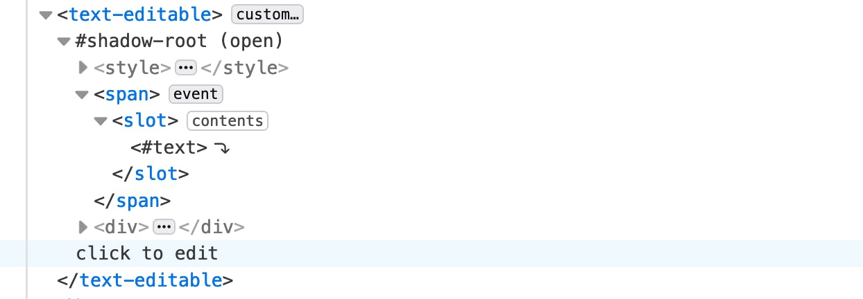 The slot tag viewed in DevTools shows you the referenced nodes.
The nodes are referenced, meaning that modifying the slotted nodes (i.e. the text node in our case) will also get reflected inside the web component.
The component dispatches an event whenever it is updated:
// dispatch an event to let the outside world we updated the text
this.dispatchEvent(new CustomEvent("update"));
We can listen for this event exactly the same way as we listen to an event from a standard HTML element, using addEventListener. This is because all web components inherit from HTMLElement, so they all have the standard DOM API. This is then how you would set the listener:
// get the first <text-editable> node in the page
const el = document.querySelector("text-editable");
// listen for "update" events:
el.addEventListener("update", () => {
    alert("update event caught!");
});
Go build some web components
The simplicity and the ready-to-useness of web components available today in nearly all common browsers is just awesome. The browser offer developers a powerful and standard tool to create and reuse pieces to compose our pages.